

The colours of ICA-Belgium
A semantic commentary, by Inez Michiels

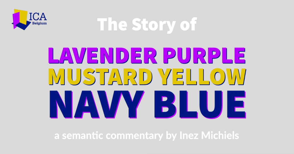
Choosing the colours for the logo of a colour association that is close to your heart is not an easy task. We as founders each have a strong vision and professional experience with colours. We each look from our specific colour knowledge and experience to what ‘our’ logo should be. It will therefore not surprise you that the final choice for the colour combination lavender purple on mustard yellow on navy blue was the result of days of consultation. Fascinating, because in selecting the colours not only our different professional background but also our personality and vision about what the association means for each of us or should mean for the rest of the world, led to different choices. And every choice tells a different story, radiates a different feeling in terms of design semantics.
Lavender purple
Purple is a colour that appears prominently in visual communication about magic and art. At the same time, you find purple in environments where data is processed, such as with telecom or internet related services. Purple is a connecting colour, it establishes connections like the synapses do in the brain. In the medical world, purple appears in the representation of brain disorders such as dementia and insanity. We can see the ‘understanding’ as a purple activity in which the meaning is grasped.
Lavender is a softened purple because of the addition of white. This way the magical purple obtains a lightweight immaterial quality, specific to white. White is the scientific colour par excellence. By lightening the data processing purple, knowledge is added.
Lavender purple is a somewhat crazy but also a clever tint evoking the atmosphere of a soft artistic magical spectacle that connects data, ideas and knowledge.


Mustard yellow
Yellow is the colour associated with heaven as a worldwide symbol of spirituality and positivism. The high heaven is the place where the gods live and from where the world was created. You hear little bells tinkle, or the sound of a harp. An unreal immaterial world in which you have to believe and look up to with reverential respect. It stands for the maximum that man can achieve. Heaven is also the firmament, a construction of seemingly eternal rotating planets around the sun, which indicates time on earth. In heaven there is an energy, fast like lightning. It feels sharp and wakes up, like the prick of a needle, the rattle of the alarm clock or the flickering and blinking of a lamp. It makes curious so to come near. The concept is expansive and directed outward. Finally, the view is synthesis from above, the overview.
Mustard yellow is derived by adding a little touch of black. While white, because of its lightness is a revealing colour, black on the other hand has a concealing power. It brings a heaviness and solidity to the bright yellow. This way the yellow spirituality far up above, is somewhat brought down to earth. Also the sharp, rattling, blinking energy is tempered and more in control.
Mustard yellow evokes a controlled spiritual energetic creativity that calls for respectful attention.


Combining purple on yellow
When the artistic, magical and connecting purple is combined with the creating, over-viewing yellow, an atmosphere of joyful coming out and showing off arises, such as the opening of an art exhibition or a symposium. It is an enthusiastic and attention-grabbing colour combination, which is not earnest but rather playful.


Navy blue
The concept of a blue earth contains ideas such as space, distance and depth. On the other hand, the earth is the massive ground on which we stand, the firm carrier. The earth supplies tangible raw material such as metals and minerals. For this reason blue represents what is real. Blue is a spacial colour. The space can be understood by the vast plains that the earth contains. It can also be turned inwards, such as a room or a tank.
Because blue is set as a carrier for the lavender and the mustard colour combination, its solidity has to be pronounced by adding a touch of black. By making the blue somewhat darker it becomes balanced and solid.
Navy blue provides the solid balanced openness necessary for to carry the artistic and creative forces of purple and yellow.


About the shape
With the three plates that cross each other perpendicular, an open corner or place is created where the exhibit and performance can take place. The upright plates in lavender and mustard provide the walls for hanging or projecting material. At the bottom is the platform, the solid carrier in navy blue, where the color experts can show off. At the same time, the three directions symbolize the interdisciplinary approach of the colour association.
Conclusion
The logo of ICA-Belgium radiates a solid balanced openness where the display and the connection of magic creative knowledge and ideas can take place.
