

Mitja Tušek – Colors between Abstraction and Figuration
Reflections on the exhibition Wait and See, by Vinciane Lacroix

Mitja Tušek? Before visiting the Centrale for Contemporary Art, I had never heard of him. Born in Slovenia in 1961, raised in Switzerland, and now based in Brussels, Tušek has built a body of work where color is at once subject, material, and tool. His series of female bodies alone is enough to mark him as a great colorist. In fact, it alone would be worth the visit (see Constanzes opening above).
At first glance, the six series on display seem so different that it is hard to believe they were created by the same artist. And yet, as the title Wait and See suggests, with time the connections begin to emerge.
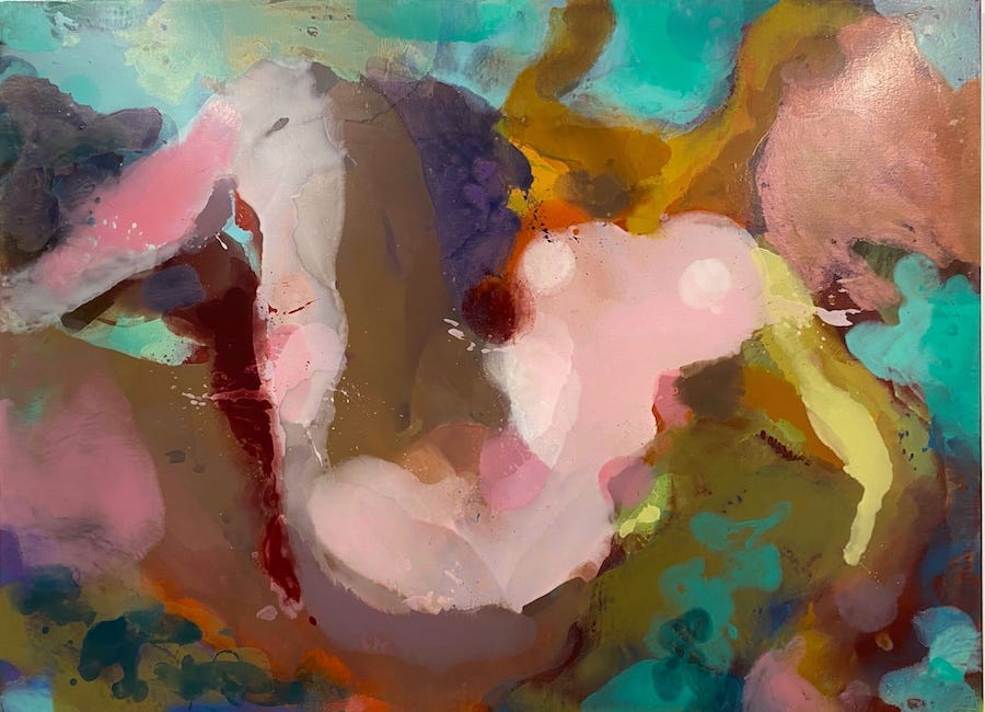
Nude Women
In the Nude Women series, Tušek lays a canvas on the floor, pours paint onto it, then presses another canvas on top, much like a monotype. When the canvases are pulled apart, he repeats the process until a female figure begins to take shape. Each canvas functions both as matrix and as imprint, giving rise to an almost symmetrical double. The process is long. Slow. Repetitive. Sometimes abandoned and revisited years later — even a decade later.
This theme of the double, born here through a methodical construction, returns elsewhere in his work, notably in the hidden–revealed texts series. In the exhibition’s large room, one cannot help but think of Rorschach tests. The mirror link is firmly in place.
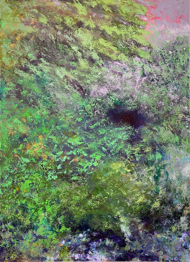
Landscapes, undergrowth, forests
This technique of transfer reappears, differently handled, in his abstract landscapes - sometimes also titled undergrowth or forests. It is hard not to think of Giverny variations, since the palette recalls Monet’s late works. Here, instead of a second canvas, bubble wrap is used, imprinting its peculiar texture into the paint. Once again, the successive layers reveal a slow, patient process.
Graphic work
The pure black-and-white forms of the 2024 series seem to have escaped from his 2021 works, as if oversaturated color had suddenly given way to graphic urgency.
In his most recent series Schedel, inspired by the Schedelsche Weltchronik (a universal chronicle published in 1493), Tušek combines tarot-like graphic lines with interference pigments that shift from every angle. Soft, elusive colors - like soap bubbles or butterfly wings - glaze over the lines with a magical aura. Is this a metaphor for the elusive nature of these strange figures? Or an invitation to reflect on the variability of our own gaze on marginal people? Either way, the device brings the drawing to the forefront. As with Léger or Dufy, it is the line that structures the work and builds the forms.
Chromatic and pictorial explorations
Over time, Tušek’s work can be read as an exploration of different chromatic registers. Black and white imprint the forms with a strong character, while bright hues evoke childhood, noise, life, joy. In the text paintings, the contrast between matte and glossy produce subtle, fleeting effects — invisible in photographs, offered only to those physically present. This time, no interference pigments, just pure reflection.
Another avenue: the treatment of the background. Sometimes built up in strata leaving room for chance in paint transfer and transparency, sometimes laid down as a flat ground from the start. In the diptychs, I invariably find myself preferring one canvas over the other - usually the one where a reading direction imposes itself more clearly. I would isolate it, away from its twin; but that, of course, is entirely personal.
Conclusion
Beyond the apparent diversity of styles, Tušek’s œuvre consistently raises questions about color: its autonomy, its registers, and its expressive power.
And also: Bertille Bak
Not to be missed are the remarkable videos of Bertille Bak, invited by Tušek to join the dialogue. With playful humor, she addresses serious topics such as child labor, evoked here through tiny colored chicks distracting larger birds. Her metaphorical narratives - balancing tenderness and unease - would deserve an article of their own, but go beyond the “color” focus of this series.
Two artists to watch, without a doubt. And my thanks to the Centrale for this discovery.
Vinciane Lacroix is the editor of the Colour Exhibitions column of the ICA-Belgium Colour News.
You can read more about her here.

ICA-Belgium is a community of colour lovers that share a common interest in colour, spanning the fields of art, design, architecture, science, industry, education, linguistics, philosophy, history… Join us and get to know other colour enthusiasts and professionals from all around the world (yes, we have international membership!), share about your work, develop opportunities for collaboration, build connections and contribute to a dynamic colour platform.