

Hommage to Josef Albers #05
Essays on Albers by the organisers of the workshop Interaction of Colour in Space
By Maria Zurbuchen-Henz
Sharp-cut grey, blue, white and light blue or vibrant transitions of purple, magenta and pink - as a viewer, I feel the magic of the colours; as an architect, I am, in a way, drawn into a three-dimensional polychrome space.
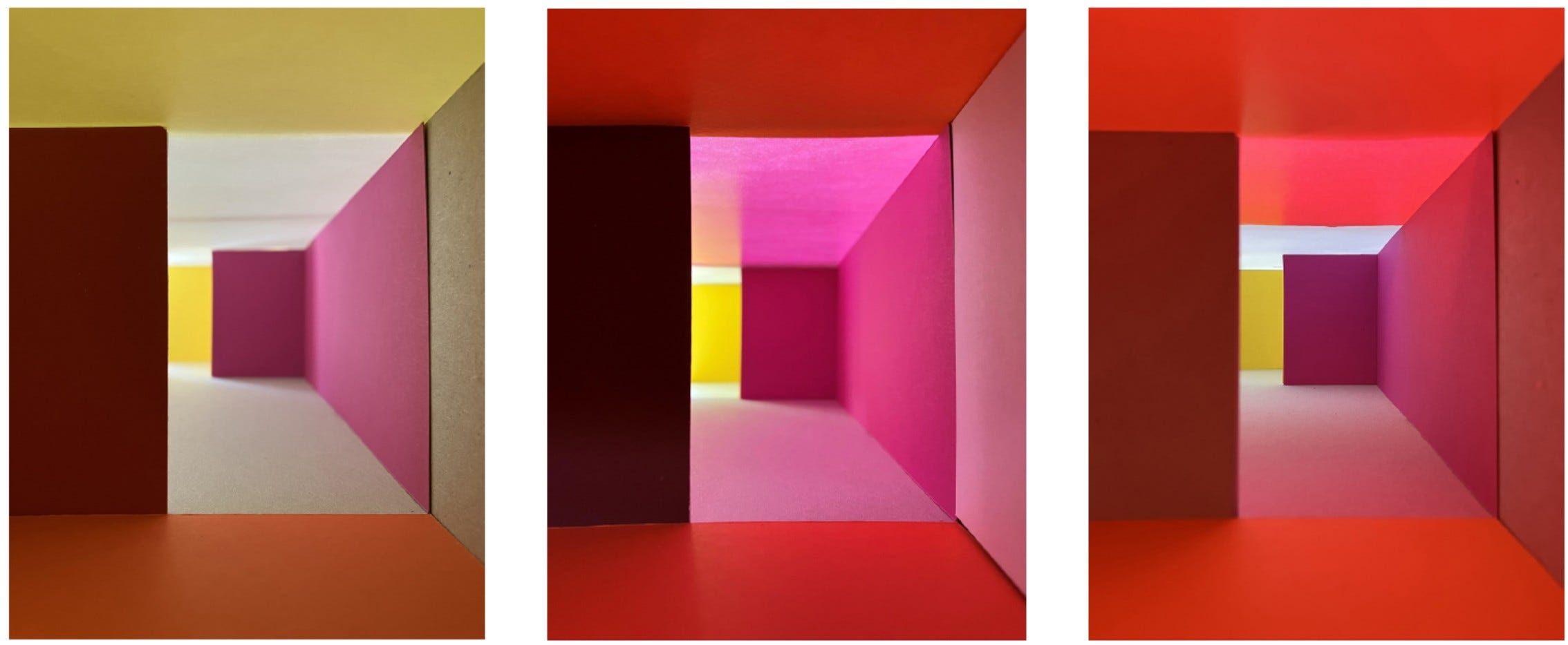
Albers’ Homage for a Square series is based on geometrically composed figures with no overlapping colours. The surface of the canvas is articulated by contiguous yet distinct, independent colours. In addition to the picturesque effect and the play of light, Albers introduces the illusion of perspective. The artist does not confine himself to arranging concentric squares; on the contrary, the squares are shifted and grounded in perspective. Familiar with the drawing conventions of diagonal lines and the vanishing point, we can read the pictorial space as an architectural one. As the vanishing point corresponding to eye level is set low, one gets the impression of a deep, relatively high polychrome interior that one could walk into. (You can easily check that this is true, by turning the picture upside down, in that case, you fly into the picture).
Long regarded as opposing forces, Albers considers the concepts of Venetian colore and Florentine disegno as equally important. This is precisely what makes his two-dimensional pictorial space relevant for comparison with three-dimensional architectural space. Inspired by Albers’ paintings, I would like to extend his topic of Colour Interaction into the polychrome interior. What is the common ground between visual art and architecture? Is it possible to transfer painting concepts to architecture?
Pictorial space functions as an optical illusion of volume and depth. On the canvas, colours lie side by side on a single plane; but the painter can break free from the constraints of two-dimensionality by choosing the right palette.
Architectural space is real, its elements are mass and void, light and shade. How does colour bring an additional quality into built space? What happens when you add illusionistic effects to the physical space using colour? According to Le Corbusier, the lit wall constitutes the architectural game. Colour is another form of light and shadow and therefore space-forming. Blue steps back, red steps forward: the transforming effect on volume, space and ambiance is based on optical illusion, creating in the mind another appreciation of the object. Since colour modifies the form, the spatial principle and the colour concept are inseparably linked.
In architecture, colours don’t lie side by side on a singular plane, but they are arranged in layers extending into the depth, face each other, or interact diagonally across the corner. That is why the interaction of colour in a built environment can be far more complex than in a painting.
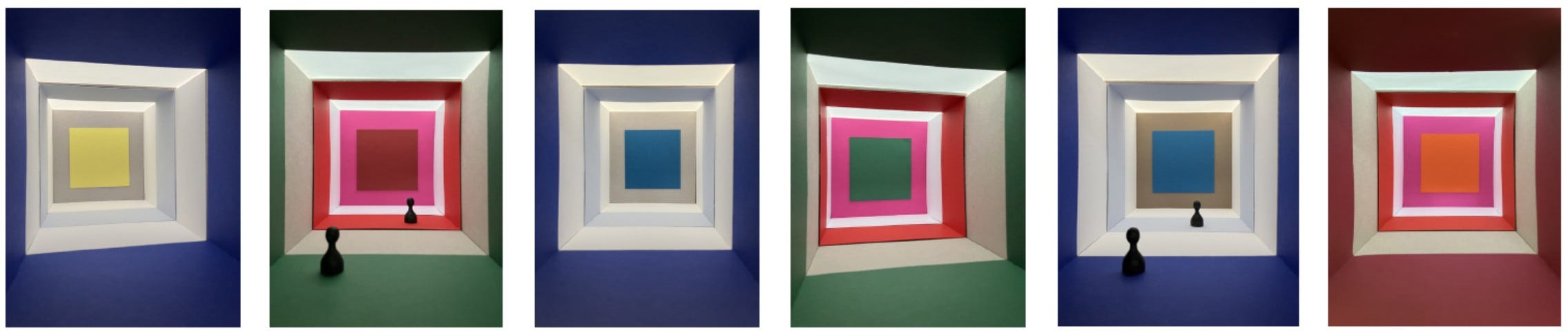
Material or immaterial? In the discussion about the role of colour in architecture, we need a deeper understanding of what colour is and how it works with both its tangible and intangible properties. On the one hand, we deal with colour in its material appearance, the color pigment that forms the outermost skin of architecture as a painted layer. In contrast to this - or even as a complement – is the colour of light. As an immaterial phenomenon, it influences the colour effect of an architectural object. A coloured light can occur as a concomitant of a coloured paint (for example, in the form of radiation) or also as an independent light-colour. What is the relationship between the geometry of the room, the colour tone and the light effect? How far does the sphere of influence of applied colour go in an interior space? Sculptural effects are enhanced by light-dark contrasts while pictorial effects by colour gradients or colour contrasts. Bright colours can produce atmospheric colour-light impressions varying from sharpness to blurriness. To summarize, subtractive color mixing of pigments (material) and additive light-mixing (immaterial) do not have the same impact, however, both phenomena can occur simultaneously.
Should colour strengthen and clarify the architectural form, comment and interpret it in a playful way, or maybe even manipulate it? What is certain however, is that colour is very important because it acts strongly upon our sensitivities. We could take Le Corbusier and Barragán as examples. Both need white as a neutral background, but their use of colour is quite different. In Le Corbusier’s design method, manipulations of spatial perception are allowed, but they must not interfere with the form through strong side effects. In order to maintain the tectonic character of his architecture, Le Corbusier would use sharp-cut, independent colour surfaces (bound to the entire wall as a whole) and apply a well-tempered palette originated from traditional mineral pigments. In contrast, the Mexican architect Luis Barrágan is not afraid of bold, artificial colours and vibrant colour-light effects. In his monastery chapel, he introduces yellow light produced by coloured glass panes and a golden altar triptych. The yellow light blends with the colours of the walls, causing their surfaces to shimmer: this creates a magical chromatic continuity that, as the day progresses, imperceptibly traverses an infinite spectrum of yellow, red and orange reaching its climax in gold.
This year the Albers Workshop Interaction of Colour in Space, organized by ICA Belgium and the Deutsches Farbenzentrum, offers an opportunity for design-related experimenting with cardboard, coloured paper strips and plexiglass.
In terms of colour and light, practical workshops show that the architectural model, sometimes hastily dismissed as anachronistic, still provides irreplaceable insights. The main advantages of experimenting with analog models are being very close, at eye level, and obtaining an instant response.
Maria Zurbuchen-Henz is architect in Lausanne and professor at Haus der Farbe Fachschule für Gestaltung in Handwerk und Architektur Zürich in Switzerland. She conveys colour culture in public spaces and buildings and leads workshops on the subject of colour and space at Hochschule der Medien Stuttgart (2026, 2024), Pavillon Le Corbusier Zürich (2021), Universiteit Antwerpen (2019), Université de Strasbourg (2017)
This essay is part of a Collection of Essays dedicated to Josef Albers, where the organisers of the workshop Interaction of Colour in Space share their thoughts about Josef Albers and his impact on their work.
For more information about the upcoming workshop, see:
